An Oracle Answers and Oracle Dashboard Walkthrough
If you read my article the other day on the architecture of OracleBI Suite Enterprise Edition, here's a walkthrough of creating a simple report and dashboard. It's using the Siebel version of the tools as the Oracle branded versions aren't available yet on OTN, but the steps are the same regardless.
In this walkthrough, you are a sales manager looking to analyze the performance of your organization. You want to see how well products are selling by countries and regions, and understand how sales break down by marketing manager and the product you sell. You would also like to see these results graphically, and on a dashboard that comes up whenever you log in.
Before you start, your administrator has imported the Global Sales Sample data into the physical layer of the Enterprise Semantic Model, and then used this to build the business and presentation layers.
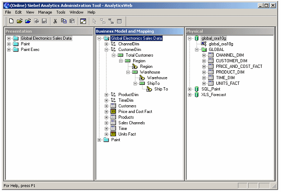
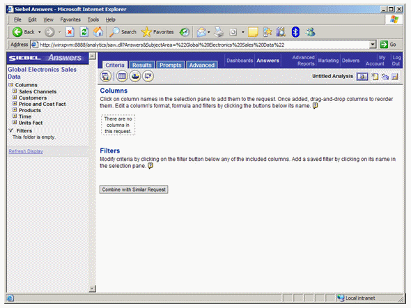
Now the data is ready, you start up Siebel Answers and select the Global Electronics Sales Data subject area.
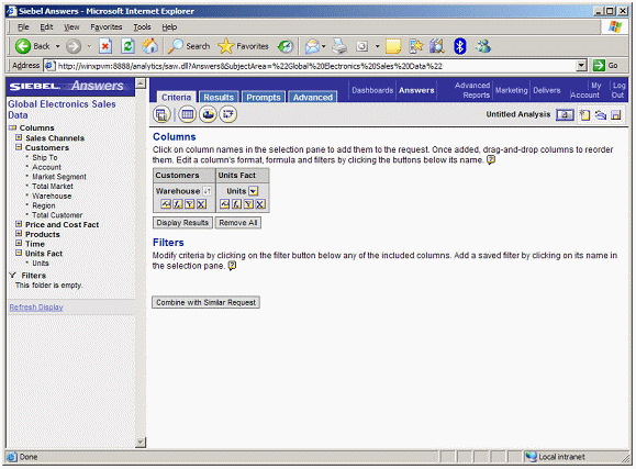
The first task is to produce a report of sales by country. You start this process by selecting Warehouse and Units from the available items pane on the left, which then adds the items to the columns area on the right-hand side of the page. By clicking on the arrows icon next to the item name, you sort the table from top to bottom using the units item.
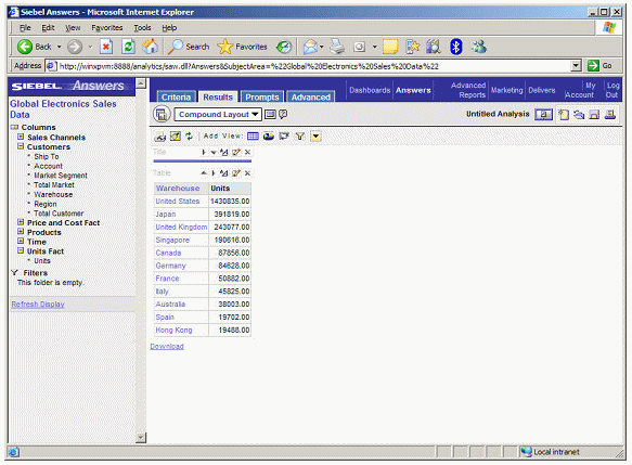
Note that the right-hand side of the page has four tabs. The criteria tab shows you the data items that are included in your report. The results tab shows you a live view of the data, like this:
Whilst the Prompts tab allows you to define parameters, and the Advanced tab exposes the logical SQL used by the query, together with it's XML representation.
Next you decide to add a graph to this table. You click on the pie chart icon next to the Add View: control above the table, and are then presented with the default graph view, a bar chart, for your data.
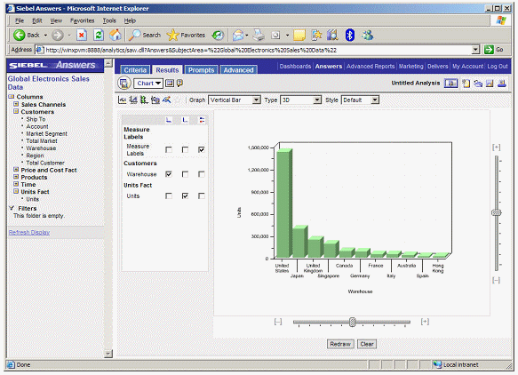
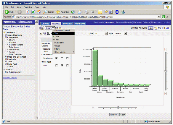
A graph is a type of "view" over your data, as is the table you created earlier. The drop-down list under the right-hand tabs lets you select and create various views over your query, and to finish the job off, you use the control to select "Title" and give the report a title.
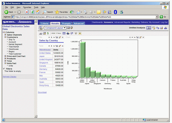
Finally, you select Compound Layout which displays the table and chart on the same page.
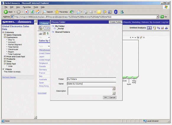
You save the report before moving on to the second one.
You now wish to create a report with several perspectives on marketing manager performance. To do this, you press the "Create a new request" button on the top right-hand side of the page, and bring in marketing manager and units sold. You do this with the Results tab open, and then add the product family, noting that data gets added to the view as you go along, displaying the report "live" as you add columns.
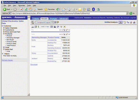
Notice how the Marketing Manager and Product Family items are in light blue - this is because they are hyperlinks to lower levels of detail, and you can click on them to drill-down to more detail.
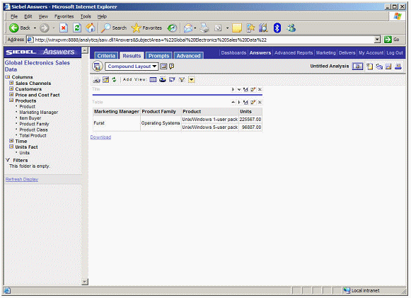
To perform this drilling, Siebel Answers applies a filter to the results. To see the filter, you click on the Criteria tab.
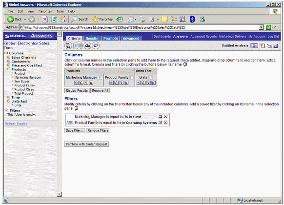
You remove the filter and go back to the original view.
Now you decide to turn the table of data into a crosstab. You click on the View control and select "Pivot Table".
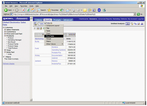
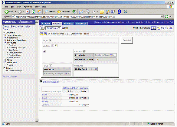
Using the pivot table designer, you swap out product family for product class, then place it on the Y axis of the pivot table.
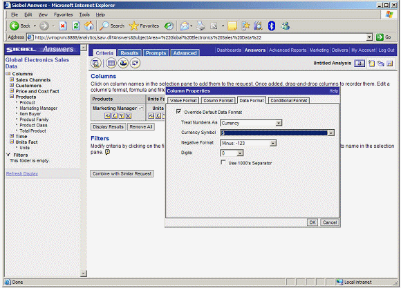
Next, you format the Units items as currency.
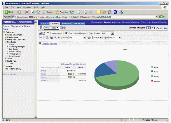
And then you display the crosstab, with a pie chart next to it to show proportion of overall contribution.
After saving this second one, you want to publish the two reports as a dashboard. To do this, you click on the Dashboard link next to Answers at the top of the page.
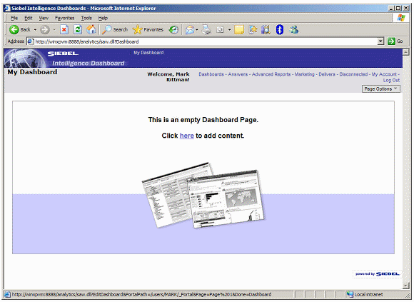
As this is your first dashboard, you are presented with the default, blank page that invites you to add some content.
 Af
Af
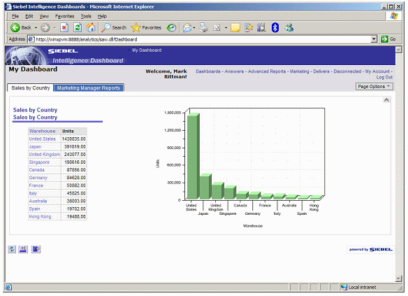
After clicking on the link, you drag "Sales by Country" from the available reports pane onto the dashboard.
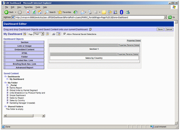
You then save the dashboard and view it.
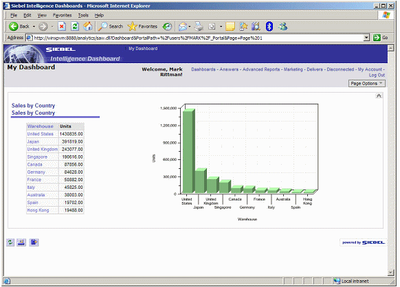
So far so good. Now you would like to add the Marketing Manager report; you could add this report to the side of the one you've just added, or you could place it under the existing one, but you'd like to add a second tab to the dashboard and place it there. To do that, you click on the "Page Options" control on the top right-hand corner of the dashboard, and select "Edit Dashboard", then press the button to add a new page.
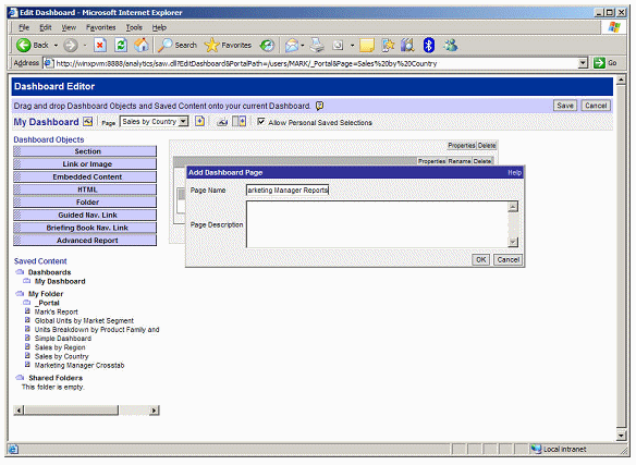
Then you click on the "Dashboard Properties" button and rename the pages, which become tabs on your dashboard.
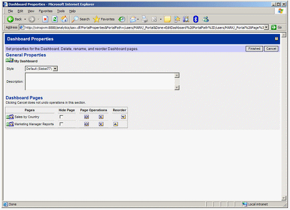
Then, when you go back to view your dashboard, you've got two tabs, one for sales reports, one for marketing manager reports.
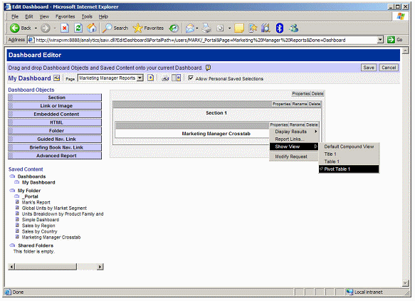
Then, it's a simple job to click on the marketing manager reports tab, and add the second report to the dashboard. Make sure you select Pivot Table as the view over your data, so that it shows the crosstab and the graph that you added.
Then, finally, you can view your dashboard.
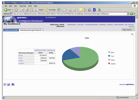
So there you have it. That's a very simple view of creating reports, graphs and dashboards, and I've deliberately kept it as close to Discoverer and Portal as possible, so that I can start to draw parallels and links between the two sets of technologies. Going on from here, I'd go on to create Answers reports that have multiple queries on the same page, and multiple views of the same data, and then start delivering those reports as alerts when certain thresholds are crossed. The dashboard product is a lot more sophisticated as well, and like Portal, you can include external web content, other reports and links to other applications as needed.
That's it for me on Oracle BI Suite Enterprise Edition for a while. I'm presenting on it at the UKOUG BI & Analytics Event next week in London, so if you're coming along, say hello. This is the demo that I'll be doing so if you come along, you'll be able to see it live.