Analytics with Kibana and Elasticsearch through Hadoop - part 3 - Visualising the data in Kibana
In this post we will see how Kibana can be used to create visualisations over various sets of data that we have combined together. Kibana is a graphical front end for data held in ElasticSearch, which also provides the analytic capabilities. Previously we looked at where the data came from and exposing it through Hive, and then loading it into ElasticSearch. Here's what we've built so far, the borders denoting what was covered in the previous two blog articles and what we'll cover here:
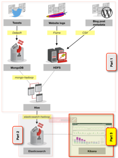
Now that we’ve got all the data into Elasticsearch, via Hive, we can start putting some pictures around it. Kibana works by directly querying Elasticsearch, generating the same kind of queries that you can run yourself through the Elasticsearch REST API (similar to what we saw when defining the mappings in the previous article). In this sense there is a loose parallel between OBIEE’s Presentation Services and the BI Server – one does the fancy front end stuff, generating queries to the hard-working backend.
I’ve been looking at both the current release version of Kibana (3.x), and also the beta of Kibana 4 which brings with it a very smart visualiser that we’ll look at in detail. It looks like Kibana 4 is a ground-up rewrite rather than modifications to Kibana 3, which means that at the moment it is a long way from parity of functionality - which is why I’m flitting between the two. For a primer in Kibana 3 and its interface see my article on using it to monitor OBIEE.
Installing Kibana is pretty easy in Kibana 3, involving a simple config change to a web server of your choice that you need to provide (details in my previous blog), and has been made even easier in Kibana 4 which actually ships with its own web server so you literally just download it, unarchive it and run it.
So the starting point is the assumption we have all the data in a single Elasticsearch index all_blog, with three different mappings which Kibana refers to accurately as “types”: blog posts, blog visits, and blog tweets.
Kibana 3
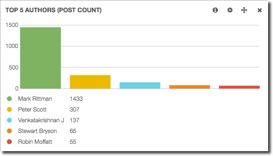
Starting with a simple example first, and to illustrate the “analysed” vs “non-analysed” mapping configuration that I mentioned previously, let’s look at the Term visualisation in Kibana 3. This displays the results of an Elasticsearch analysis against a given field. If the field has been marked as “not analysed” we get a listing of the literal values, ranking by the number of times they repeat. This is useful, for example, to show who has blogged the most:
But less useful if we want to analyse the use of words in blog titles, since non-analysed we just get a listing of blog titles:
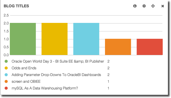
(there are indeed two blog posts entitled “Odds and Ends” from quite a while ago 1 2)
Building the Term visualisation against the post title field that has been analysed gives us a more interesting, although hardly surprising, result:
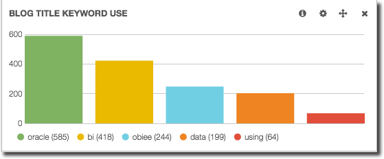
Here I’ve weeded out the obvious words that will appear all the time (‘the’, ‘a’, etc), using the Exclude Term(s) option.
Term visualisations are really useful for displaying any kind of top/bottom ranked values, and also because they are interactive - if you click on the value it is applied as a filter to the data on the page. What that means is that we can take a simple dashboard using the two Term objects above, plus a histogram of posts made over time:
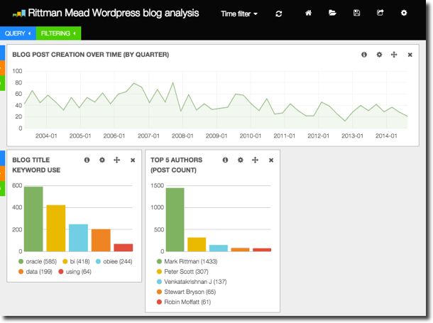
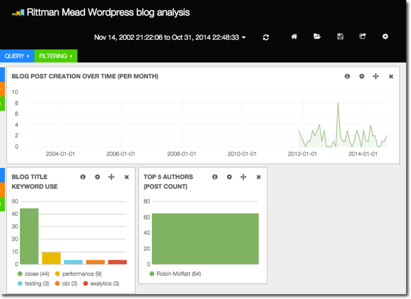
And by clicking on one of the terms (for example, my name in the authors list) it shows that I only started posting on the Rittman Mead blog three years ago, and that I write about OBIEE, performance, and exalytics.
Taking another tack, we can search for any term and add it in to the histogram. Here we can see when interest in 11g (the green line), as well as big data (red), started :
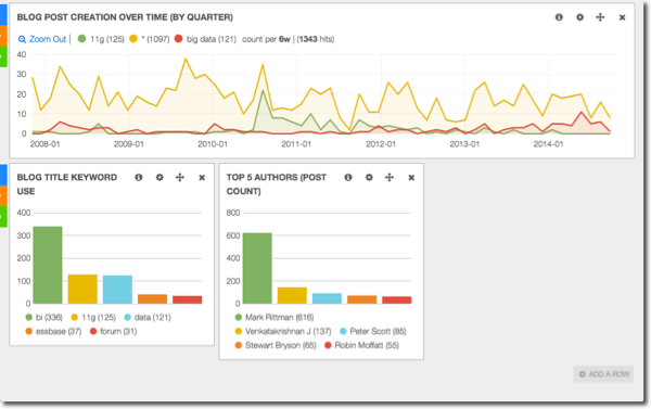
Note here we’re just analyzing post titles not content so it’s not 100% representative. Maybe loading in our post contents to Elasticsearch will be my next blog post. But that does then start to get a little bit meta…
Adding in a Table view gives us the ability to show the actual posts and links to them.
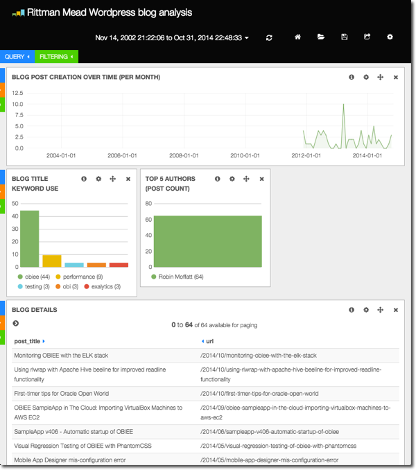
Let's explore the data a bit. Clicking on an entry in the table gives us the option to filter down further
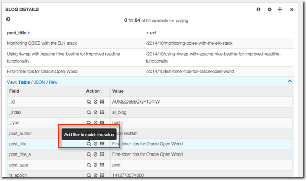
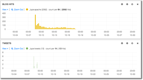
Here we can see for a selected blog post, what its traffic was and when (if at all) it was tweeted:
Interesting in the profile of blog hits is a second peak that looks like it might correlate with tweets. Let’s drill further by drag-clicking (brushing) on the graph to select the range we want, and bring in details of those tweets:
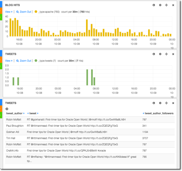
So this is all pretty interesting, and importantly, very rapid in terms of both the user experience and the response time.
Kibana 4
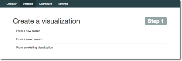
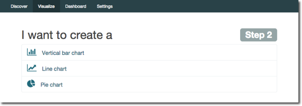
Now let’s take a look at what Kibana 4 offers us. As well as a snazzier interface (think hipster data explorer vs hairy ops guy parsing logs), its new Visualiser builder is great. Kibana 3 dumped you on a dashboard in which you have to build rows and panels and so on. Kibana 4 has a nice big “Visualize” button. Let’s see what this does for us. To start with it’s a nice “guided” build process:
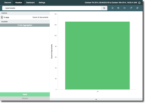
By default we get a single bar, counting all the ‘documents’ for the time period. We can use the Search option at the top to filter just the ‘type’ of document we want, which in this case is going to be tweets about our blog articles.
Obviously, a single bar on its own isn’t that interesting, so let’s improve it. We’ll click the “Add Aggregation” button (even though to my pedantic mind the data is already aggregated to total), and add an X-Axis of date:
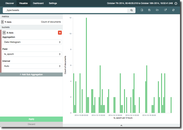
The bucket size in the histogram defaults to automatic, and the the axis label tells us it’s per three hours. At the volume of tweets we’re analysing, we’d see patterns better at a higher grain such as daily (the penultimate bar to the right of the graph shows a busy day of tweets that's lost in the graph at 3-hour intervals):
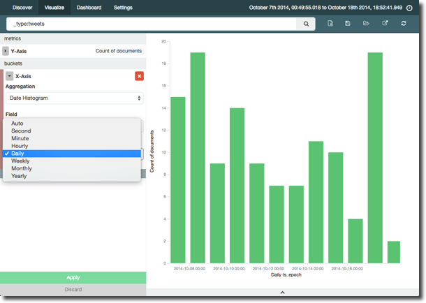
NB at the moment in Kibana 4 intervals are fixed (in Kibana 3 they were freeform).
Let’s dig into the tweets a bit deeper. Adding a “Sub Aggregation” to split the bars based on top two tweet authors per day gives us this:
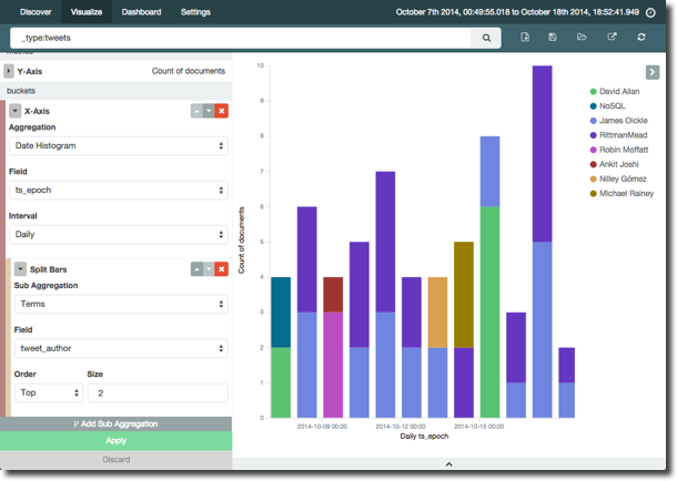
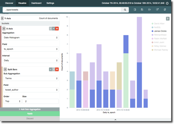
You can hover over the legend to highlight the relevant bar block too:
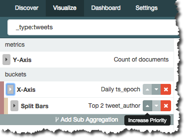
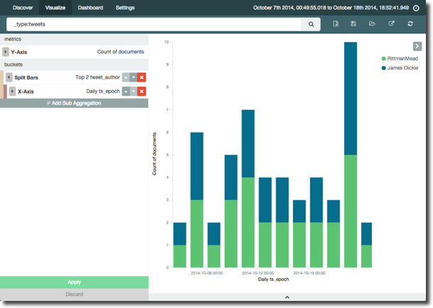
Now with a nifty function in the Visualizer we can change the order of this question. So instead of, “by day, who were the top two tweeters”, we can ask “who were the top two tweeters over the time period, and what was their tweet count by day” – all just by rearranging the buckets/aggregation with a single click:
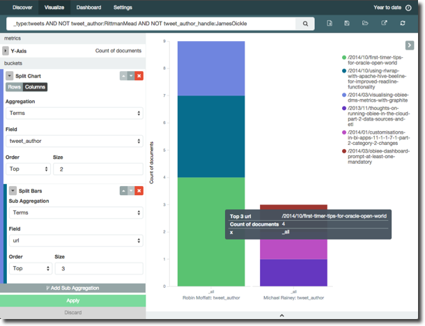
Let’s take another angle on the data, looking not at time but which blog links were most tweeted, and by whom. Turns out I’m a self-publicist, tweeting four times about my OOW article. Note that I've also including some filtering on my data to exclude automated tweets:
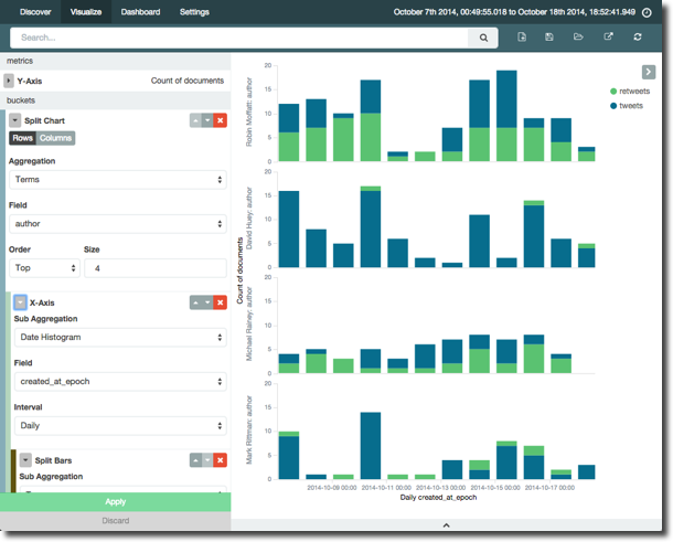
Broadening out the tweets to all those from accounts we were capturing during the sample we can see the most active tweeters, and also what proportion are original content vs retweets:
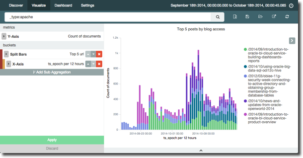
Turning our attention to the blog hits, it’s easy to break it down by top five articles in a period, accesses by day:
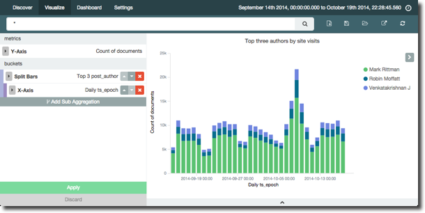
Having combined (dare I say, mashed up) post metadata with apache logs, we can overlay information about which author gets the most hits. Unsuprisingly Mark Rittman gets the lion’s share, but interestingly Venkat, who has not blogged for quite a while is still in the top three authors (based on blog page hits) in the time period analysed:
It’s in the current lack of a table visualisation that Kibana 4 is currently limited (although it is planned), because this analysis here (of the top three authors, what were their respective two most popular posts) just makes no sense as a graph:
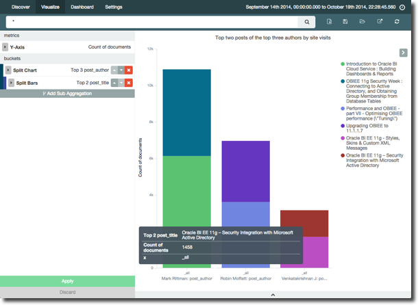
but would be nice an easy to read off a table. You can access a table view of sorts from the arrow at the bottom of the screen, but this feels more like a debug option than an equal method for presenting the data
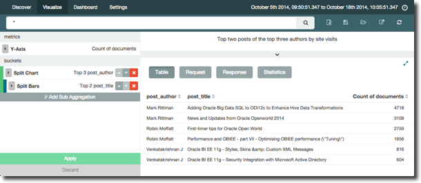
Whilst you can access the table on a dashboard, it doesn’t persist as the default option of the view, always showing the graph initially. As noted above, a table visualisation is planned and under development for Kibana 4.
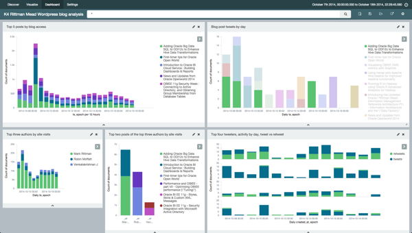
Speaking of dashboards, Kibana 4 has a very nice dashboard builder with interactive resizing of objects both within rows and columns - quite a departure from Kibana 3 which has a rigid system of rows and panels:
Summary
Kibana 3 is great for properly analysing data and trends as you find them in the data, if you don’t mind working your way through the slightly rough interface. In contrast, Kibana 4 has a pretty slick UI but being an early beta is missing features like Term and Table from Kibana 3 that would enable tables of data as well as the pretty graphs. It'll be great to see how it develops.
Putting the data in Elasticsearch makes it very fast to query. I’m doing this on a the Big Data Lite VM which admittedly is not very representative of a realworld Hadoop cluster but the relative speeds are interesting - dozens of seconds for any kind of Hive query, subsecond for any kind of Kibana/Elasticsearch query. The advantage of the latter of course being very interesting from a data exploration point of view, because you not only have the speed but also the visualisation and interactions with those visuals to dig and drill further into it.
Whilst Elasticsearch is extremely fast to query, I’ve not compared it to other options that are designed for speed (eg Impala) and which support a more standard interface, such as ODBC or JDBC so you can bring your own data visualisation tool (eg T-who-shall-not-be-named). In addition, there is the architectural consideration of Elasticsearch's fit with the rest of the Hadoop stack. Whilst the elasticsearch-hadoop connector is two-way, I'm not sure if you would necessarily site your data in Elasticsearch alone, opting instead to duplicate all or part of it from somewhere like HDFS.
What would be interesting is to look at a similar analysis exercise using the updated Hue Search in CDH 5.2 which uses Apache Solr and therefore based on the same project as Elasticsearch (Apache Lucene). Another angle on this is Oracle’s forthcoming Big Data Discovery tool which also looks like it covers a similar purpose.
