Data Visualisation Best Practices in Oracle Analytics

Best practices are like a good guidebook that helps anyone work with a tool with ease. Industry standards in general provide what we should do and how we should do it and these are generally advice that comes from experts that have been time tested over a period of time.
When it comes to best practices in Dashboards, not all Dashboards are the same and it is vital to understand various elements like the key metrics that go in the Dashboard, the types of visualisations, prompts and filters, title, logo, the colour palette for the Dashboard, calculations that go in the columns that may be used for filters, prompts etc.
If you are in the process of building a Dashboard and looking for ways to make the Dashboard meet its purpose, the below pointers are a good start to optimise and make the Dashboard look visually compelling to the audience.
- Know Your Audience
A Dashboard might be consumed by a variety of audiences ranging from C-Suite executives, Service Desk Management, IT Management, and Business Executives. It is important to understand the contents that will be shown to the audience via the Dashboards and the actions to compel them to take a look at it. It is important to make sure that the Dashboards answer the questions from the appropriate perspective of these audiences.
It is a good idea to draft the Dashboard's entire layout on a piece of paper first before moving it to the real canvas. This gives more freedom in the development process.
- Identify the type of Dashboard
Dashboards can be consumed by people at the C-Suite level, analysts and at operational level. It is important to communicate the right KPIs, and data to these people. Based on the consumers mentioned above, Dashboards are split into three broad categories.
- Strategic/Executive Level - mainly for showing long-term strategies and high-level metrics that present the key metrics in a minimally interactive way.
- Operational - for showing shorter time frames and also for operational processes in response to events on an ad-hoc basis.
- Analytical - generally used by mid-management teams to track performance and Dashboards are very interactive offering a distinct variety of investigative approaches to a specific topic.
- Bring Data that is necessary for the Dashboard
Bringing in the data that is needed for the analysis is key as it improves the performance of the Dashboard drastically. Narrowing the data either by time period or by filtering data based on a dimension that is required for the Dashboard not only improves the performance but also keeps the Dashboard clean by not showing unnecessary information for the consumers and thereby misleading them.
Ensuring data is clean and correct ensures the final Dashboard is accurate. Fixing structural errors, missing data, and replacing nulls with appropriate values are all examples which lead to building a robust Dashboard in the end.
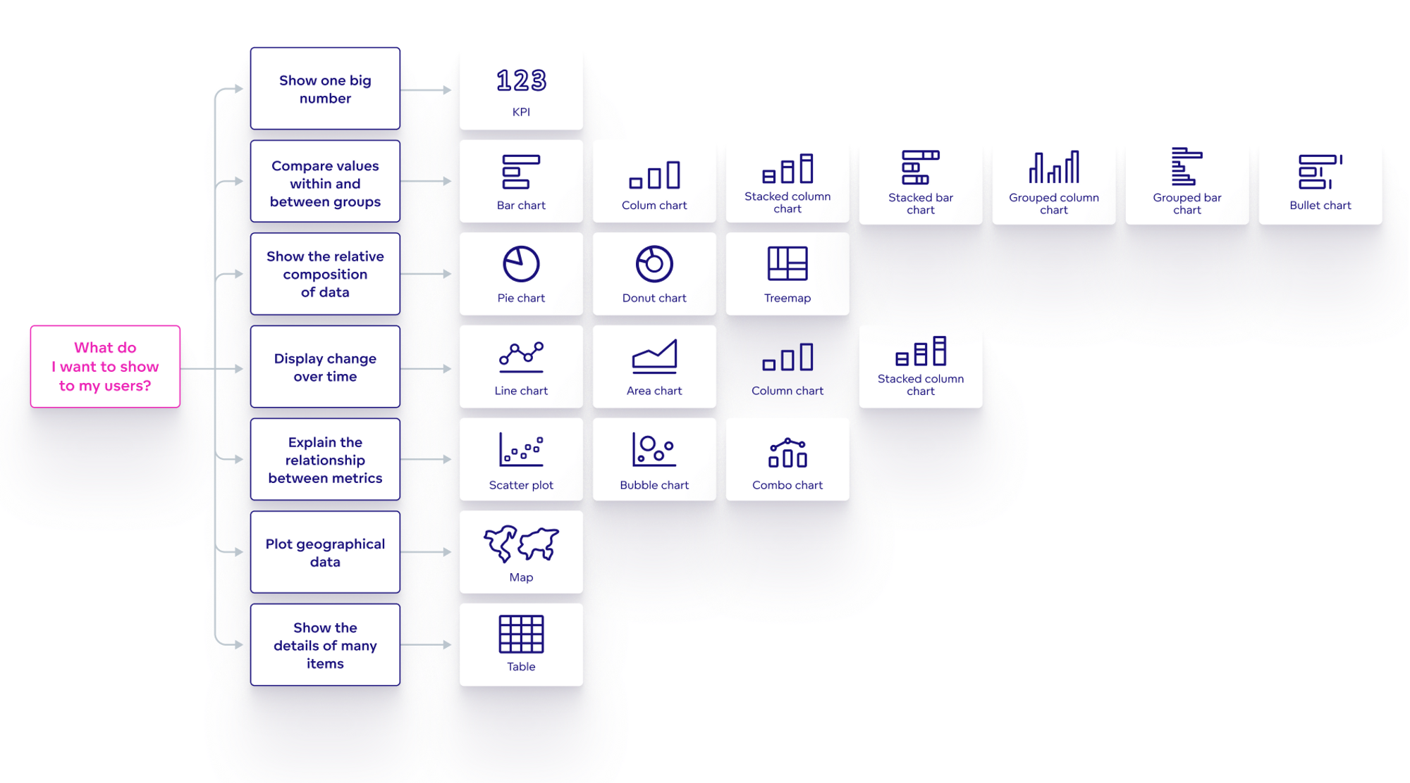
- Choosing the Right Type of Visualisation for the Datacustomise
Choosing the right chart or graph for the data conveys the information effectively to the audience. It's a good idea to go with the defaults when it comes to the usage of charts/graphs on OAC/OAS.
For example, using the default 2D Bar graphs and the default fonts, and styles in visualisations works best instead of opting for 3D Bar graphs or trying to customise the fonts and styles. It might greatly affect the consistency across the Dashboards. For a detailed view on choosing the right type of chart refer here.
- Reduce the noise in visualisations and go with the defaults
Choosing the right variables to go in a chart increases the clarity of visualisation. Avoiding variables that are highly correlated, redundant, or irrelevant to the analysis adds more context and conveys information effectively.
For example, when comparing the technical skills of employees in a company, variables like age, gender or salary are not directly related to the skills and these variables do not add any value to the analysis, instead they deter the effectiveness of the visualisation.
- Colour Branding and Logos
Usage of colours that are distinct and consistent for each category or group helps in maximising the readability. It is important to use colours that match the meaning and tone of the data.
As an example, while comparing the satisfaction of customers against a product/service, the usage of warm colours for high satisfaction and cool colours for low satisfaction conveys information effectively to the audience.
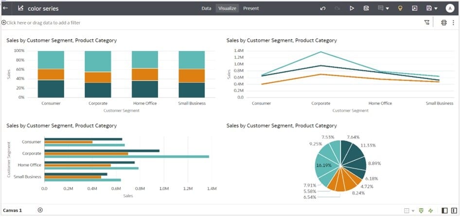
It is a recommended good practice to stick to the Oracle Analytics'(OA) default colours and let OA choose the colours for the visualisations. Exceptions could be where organisations have their own colour branding scheme, which can be customised in OAC.
The below canvas is an example where the default Redwood colour series is chosen from the colour palette.
Also, the usage of abbreviations, icons or symbols helps reduce clutter and creates more space in Dashboards.
- Add Context to Data Visualisation
Giving each data visualisation on the dashboard an appropriate title, description, tooltip, and date and time stamp helps users get more context and understanding. This information presents a guide and a model for further KPIs.
Adding interactivity in visualisations helps consumers understand data in a detailed way. Highlighting important data points, adding more context in tooltips, and providing filters for consumers to filter on a specific dimension increase readability.
- Keep KPIs to a minimum
Finding the most important KPIs that should go in a dashboard is vital as it drives the Dashboards towards effectiveness and makes the Dashboard fit for purpose. It also helps the stakeholders make the right decisions and steer the organisational goals in the right direction.
There are two important aspects that come along with a KPI:
- Date Range or time frame - the time span represented by the KPI.
- Context - adding context to the number e.g. showing the difference from a previous period or comparing it with another metric.
- Business Model Design
Although Data Structure in the physical layer can come in different ways, having a Star schema in the physical layer improves the performance. Ensure your business model always has a Star schema. The below-mentioned points are some key things to consider while designing a business model using Star schema:
- Use a separate dimension logical table for each dimension
- Don't combine/merge dimensions into logical tables
- Use a separate logical table for each fact
- Prefix logical tables with Dim or Fact
- Do not assign logical primary keys on logical fact tables as they are needed only on dimension tables.
- Make sure every fact logical column has an aggregation rule set.
- Design in an iterative fashion
Rather than waiting for the complete requirements to be fulfilled, it is a good idea to consider Dashboard development as an iterative process. This will help Product owners and other stakeholders in the organisation provide feedback and revise at various points.
As mentioned at the start of this blog, start with a blank piece of paper to design Dashboards and slowly translate it into a canvas in the form of a prototype and seek feedback from stakeholders to improve your Dashboard.
Conclusion
To conclude, when you are building a Dashboard, think to yourself if the Dashboard will serve the purpose and let stakeholders make informed decisions for the business. Keeping the design simple and clear by narrowing the incoming data, following the Star schema and keeping the KPIs to a minimum are all effective ways to build a Dashboard. Last but not least make sure, you seek continuous feedback from the Product Owners/Stakeholders for continuous optimisation of the visualisations.