The Oracle Analytics Data Visualization Challenge and the Chocolate Story

As part of the Oracle Analytics Data Visualization Challenge, Rittman Mead had the opportunity to craft a creative data story using the built-in features of Oracle Analytics DV.
About the Challenge
The Oracle Analytics team launched this challenge between February 3 and March 14, 2025; providing access to a dedicated competition instance of Oracle Analytics DV. It was creatively motivating to have the freedom to choose any publicly available dataset to weave a story we are interested in.
Since the competition's launch, we also had the opportunity to attend insightful deep-dive training sessions led by Oracle Analytics experts. These sessions covered key elements of effective data storytelling, including context and narrative, selecting the right visualisations, designing high-value dashboards, and mastering the art of impactful infographics with Oracle Analytics.
Overall, the DV Challenge was an incredible journey of creativity, exploration, and learning!
'The Chocolate Story'
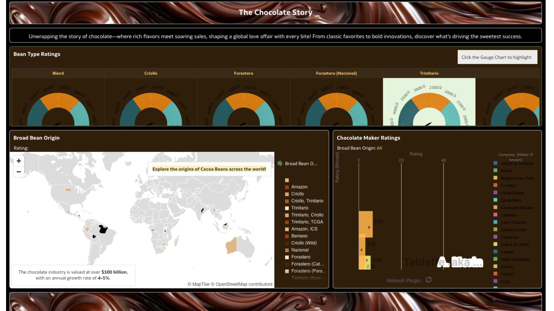
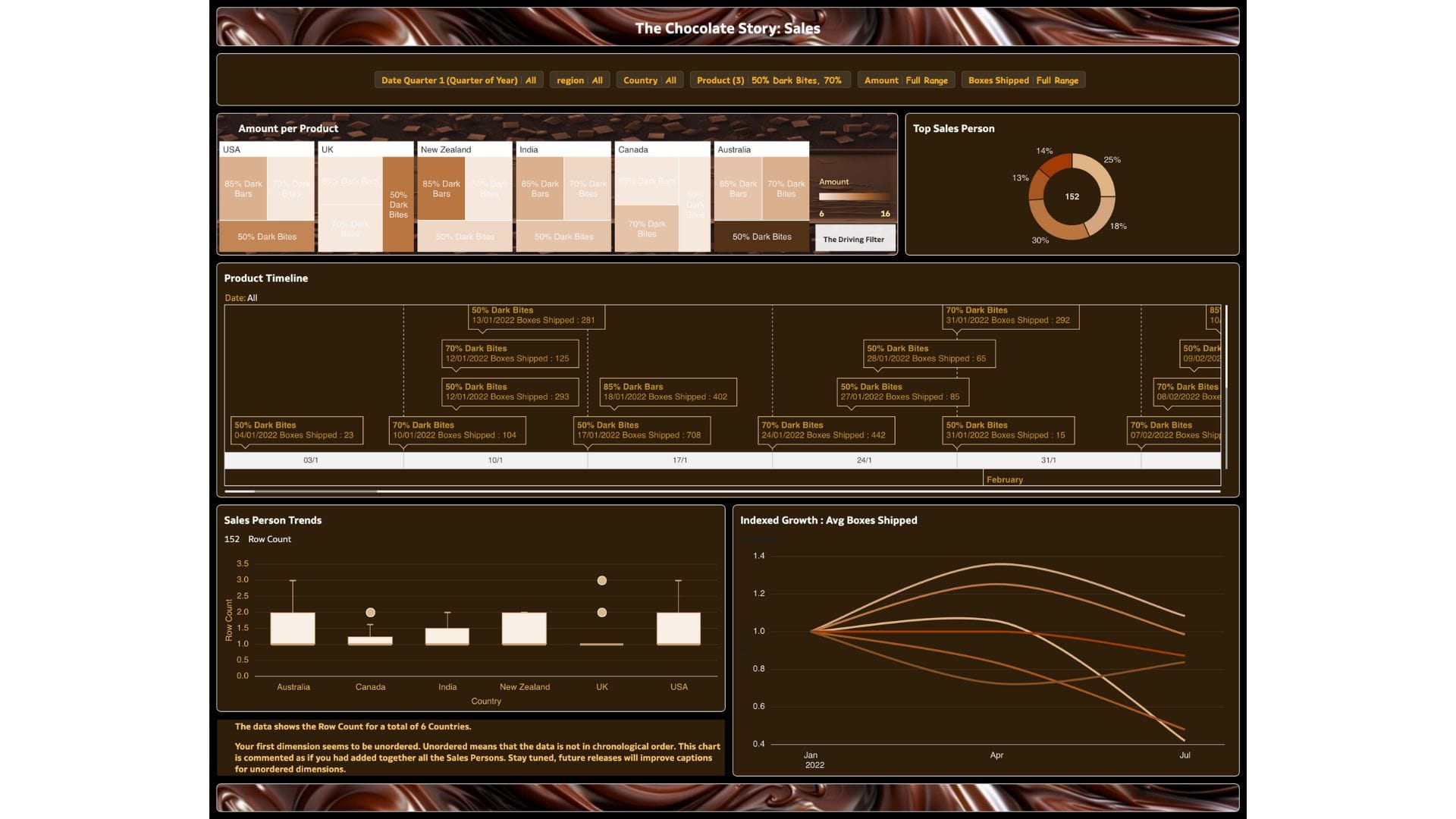
The submitted story, explored the global phenomenon of chocolate, uncovering insights into chocolate flavours and sales. It highlighted trends in flavour preferences and sales patterns, revealing what makes chocolate an irresistible success.
Here is a sneak peek at how the data story came to life! Feel free click on the vote(👍🏻) button , if you like it.


You can explore the Oracle Community Data Visualisation Gallery to draw inspiration from the top data stories submitted in this challenge!
Choosing the Right Dataset
The public dataset selected focused on chocolate flavours and sales. Even though multiple themes were explored at the outset, the Chocolate datasets looked deliciously interesting and stood out among other options because of their strong interlinking potential, allowing for deeper analysis and storytelling. The ability to connect flavours with sales trends presented a great opportunity to explore what truly drives chocolate’s popularity across markets.
Although the challenge spanned over a month, The Chocolate Story was created in less than a day - an intense night-out effort to meet the 5 AM GMT deadline. This speaks volumes about the ease, intuitiveness, and speed of Oracle Analytics DV- enabling seamless data connection, exploration, and the creation of impressive visualisations in no time.
Bringing Data to Life
One of the key evaluation criteria in the challenge was a strong focus on analysis. This meant going beyond simple visualisations and diving deep into data preparation, augmented analytics, and predictive modeling. The majority of the effort was dedicated to exploring the powerful analytical capabilities of the interface. Here are some of the key features integrated into the story:
- Data Preparation: Cleaning, structuring, and enriching data via the recommendations to ensure accuracy and strengthen the data context of the story. The recent capability of adding custom reference knowledge, for generating additional recommendations in the business/ data context, is a feature which I am always keen to explore in this phase. For the submitted story, however, the custom reference knowledge was not applied. This was because the main location-specific enrichments needed were available via the default 'System Knowledge'.
- Augmented Analytics: Leveraging AI-powered insights for better decision-making with the help of Auto-Insights and Explain capabilities. It was interesting to see how the latest filter capability of Auto Insight seamlessly helped to generate insights, applying the required conditions for the story building.
- Predictive Modeling: Creating a data flow to predict cocoa bean ratings based on various features measured. This sounds pretty complex, but not with DV! Using its built-in modeling capabilities, a numerical regression model was created and evaluated across multiple algorithms to identify the most accurate one for generating predictions on a new dataset.
- Interactivity Elements: Enhancing user engagement with dynamic visualisations, including the dynamic custom 'Racing Bars', and newly introduced Gauge chart visualisations, which I felt was pretty cool!
- One-Click ML: Implementing machine learning effortlessly for key insights with the help of references. My attempt to add the sophistication of forecast to the indexed growth line chart had to be taken off since the data was not supporting enough.
- Dashboard Prompts: With the intention of exploring the newest capabilities released in Oracle Analytics Cloud, I integrated the dashboard filter chip option, which I felt did a good job.
- AI Assistant: Enabling AI Assistant indexing for the datasets for conversational access to deeper insights, backed by the power of LLM - easily one of my favourite features. Check out our recent blogs that dive deeper into the AI Assistant feature and its optimisation.
- Contextual Insights: The latest released feature adds depth to the chosen analysis for a more comprehensive understanding and comparison of selected data with the rest of the data, helping to identify the most important contrast between them both.
The Art of Storytelling with Visuals
Beyond analysis, significant focus was placed on ensuring the visuals were both engaging and seamlessly aligned with the theme. Playing around with property elements helped create a look and feel that resonated with the essence of chocolate - rich, inviting, and indulgent. A variety of powerful visualisation types like the Timeline, Treemap, Box Plot etc, were employed to highlight the relevant insights; with the aim of making the story not just informative but also visually appealing. For complex visualisations, the Natural Language Generation capability of Language Narrative was incorporated to automatically provide high-level narration within the story.
If I had more time to refine the story, I would switch the layout to Freeform and rearrange the visualisations for better spacing, with a central image to anchor the narrative. Additionally, I would refine the design to guide the audience’s attention to key insights, applying pre-attentive attributes - a concept we explore in depth in our on-demand Data Storytelling Course, which I highly recommend checking out if you haven’t already!
Reflections and Takeaways
Participating in this challenge reinforced my appreciation for the depth and potential of Oracle Analytics. The process of bringing data to life through storytelling, coupled with technical enhancements, was both fulfilling and rewarding.
To continue our creative journey of exploring, analysing, and presenting data in innovative ways, we are excited to announce our new monthly blog series on Data Storytelling, leveraging the sophisticated capabilities of Oracle Analytics DV.
Thank you for reading, Stay tuned for more stories coming your way!
For support with Oracle Analytics Data Visualisation, or to find out more, contact us at [email protected], and chat with one of our specialists today.
